Accessibility belongs in the spec, not the audit: scoring my own site, 69 to 94 to 69 to 100
Start with the storyGo straight to the write-up
I recently read Harris Schneiderman’s (Deque) LinkedIn post on testing MCP Apps for accessibility, and it got me thinking about generative UI more broadly: wait a minute, none of this is built into my own work. I maintain an A2UI Catalog, an open-source side project of UI building blocks (I call them atoms) based on the A2UI protocol, plus some MCP app experiments. So I audited my own catalog. The results were surprising, and embarrassing.
TL;DRAn audit finds problems after the fact; a spec states up front what every component must do.My score rose, fell back when I switched on the checks it had been skipping, and still missed a keyboard-focus problem no scan could see.Show the 30-second versionHide
what
I audited my own AI-built component catalog and site for accessibility, and the results were surprising and embarrassing.
why
A post on testing MCP Apps for accessibility made me realise none of it was built into my generative UI work.
challenges
- 01Foundational standards like accessibility have to be built in from the start when an idea can ship in days.
- 02The components picked up the AI’s habits, including skipping the norms that let users rely on their own system preferences.
- 03A score is only as good as the checks behind it: mine said 94 until a second tool showed four rules were skipped, and the honest number was 69.
- 04Some failures no scanner can see, so a fix is a claim you have to test the way a user would use the thing.
conclusion
An audit finds problems after the fact; a spec states up front what every component must do.
every line quoted from the article
The story · 1 of 4
Panel 1. A post on testing MCP Apps for accessibility. On screen: a LinkedIn post by Harris Schneiderman · Deque. MCP Apps & accessibility. No score yet. - Me: None of this is built into my generative UI work.
On the screen · LinkedIn, early October 2026
Harris Schneiderman Senior Director, Product Management, Deque Systems
MCP Apps let AI tools ship real UI right inside the client (e.g., a chat interface), and since the spec says almost nothing about accessibility, I wrote up how to test them now, before inaccessible patterns become the norm.
How to test MCP Apps for accessibility, and why it matters deque.com
Curtis Krygier replying
That's really interesting - "I've" developed with AI a few MCP apps for my own use - I'll experiment and provide your article as guidance to see how that will change the scope. I think you are onto the money in as much that there is a big opportunity to influence the spec whilst it's a shiny new UI surface.
Read the scene
Panel 1. At a desk, the author leans in, worried, reading Harris Schneiderman's LinkedIn post, How to test MCP Apps for accessibility, on a laptop. A post on testing MCP Apps for accessibility. Me: None of this is built into my generative UI work.
By “in the spec” I mean something concrete. The rules every component must meet are written down and checked automatically wherever the component is made, not only when someone audits the site later. In this project that means a colour token that has to pass contrast before it can be the default, a test that fails if a table header is empty, and a test that fails if a radio button is hidden in a way a keyboard can’t reach. The audit is what tells you where the spec is missing a rule. This post is about the process more than the numbers.
Who this affects
The World Health Organisation estimates that 1.3 billion people, about 16% of the world, live with significant disability, and accessibility is what lets many of them use software at all.
Here is what that looks like in practice:
- Keyboard operation: people with tremors, arthritis or repetitive strain injury, and anyone using speech input or switches, cannot rely on a mouse.
- Reduced motion: people with vestibular disorders, epilepsy or migraine can get dizziness, nausea or seizures from endless animation.
-
Contrast and text scaling: people with low vision or colour blindness (about 8% of men of European descent, and about 0.5% of women) cannot read pale text or colour-only cues.
-
Names and text alternatives: blind people using screen readers hear only what the code names, so an unlabelled button or image is simply missing.
It also helps anyone with a broken arm, or anyone squinting at a phone in bright sunlight.
What I found
The catalog is roughly 650 components (the atoms) that an AI agent, or a human guiding it with prompts, fills in and a renderer turns into screens. They picked up the AI’s habits, including skipping the norms that let users rely on their own system preferences.
In the same order as above:
- Keyboard: eight components, including “gmail_inbox” and “annotation_highlight”, used a clickable span element with an onclick handler and no role, tab stop or key handler (WCAG 2.1.1). The carousel and tab-style components used a CSS trick that hides radio inputs with display:none, so a keyboard user could not switch slides or tabs. axe missed these. IBM Equal Access caught them.
- Reduced motion: components with unguarded infinite animation and no reduced-motion handling, which can make people with vestibular disorders unwell.
- Contrast: the default accent was 4.46:1 against the 4.5:1 AA minimum, a near miss running through many components, which affects people with low vision or colour blindness.
- Names and text alternatives: 15 canvas components had no text alternative, and some form fields and drop-downs were unlabelled or unnamed, so a screen reader user hears nothing.
It isn’t just me
AudioEye asked five AI tools to build three sites each to WCAG 2.2 AA. All 15 failed, averaging 55 issues per page, and 81% of respondents said they were confident their AI-generated code met accessibility standards. That comes from VentureBeat’s “We asked five AI tools to build accessible websites. All 15 sites failed”, a piece presented by AudioEye and written by Kelly Georgevich, AudioEye’s CEO. AudioEye sells accessibility services, so read it with that in mind.
How I measured it
- Set the standard: WCAG 2.2 A and AA.
- Cross-check engines: axe-core alongside HTML_CodeSniffer and IBM Equal Access. One engine is one opinion. Of the contrast-flagged components, only 77 were flagged by all three and 29 by only one.
- Run in the real host stylesheet, in light and dark, not on a bare white page.
- Keep it as a ratchet: new components must start clean, and flagged ones can’t get worse.
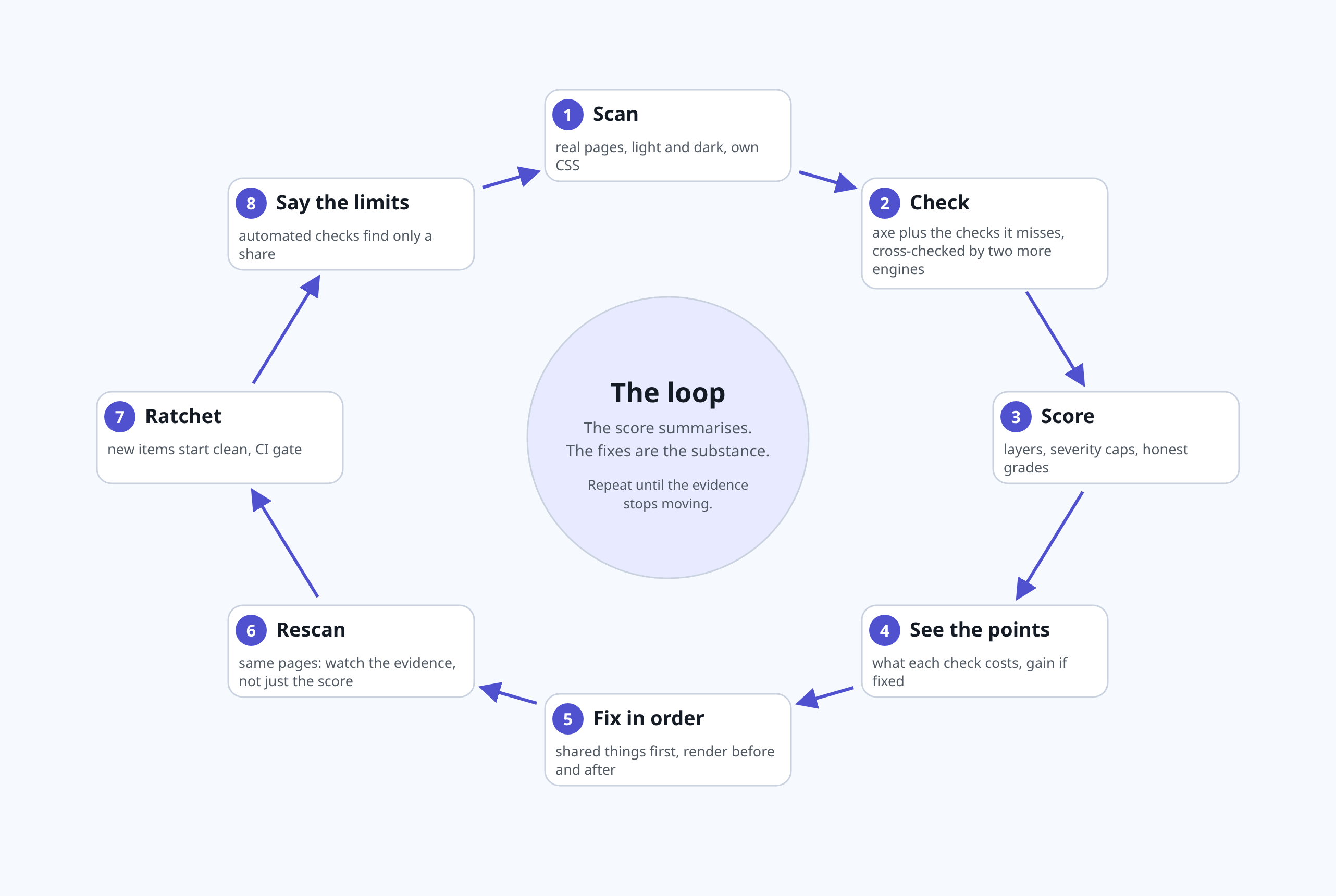
I used Claude Code in the CLI to run the audits and to check each change against the standard.
What I fixed
- A darker default accent, with a test to hold it
- Theme-aware muted text
- Three corrected host colours, the biggest single gain
- Added names and labels
- Keyboard fix: hidden inputs stay focusable, and clickable elements get a tab stop, a role and Enter/Space handling (more on that below)
One thing went wrong: a blind find-and-replace of greys was worse than nothing, and I reverted it.
As of 10 October, atoms with an axe violation fell from 172 to 121 on light and from 245 to 193 on dark. A keyboard Tab-through check now has no failing atoms. Progress, not a pass. Automated tools only see part of the problem, so green means no automated violations, never accessible.
The skill: what it does
I turned the audit into a skill that any declarative-UI schema or site can use. It:
- Takes a built folder, a URL, a sitemap or a crawl from one page, staying on one origin, following robots.txt, waiting between pages and refusing anything but localhost unless you confirm you have permission
- Scores four layers (the four WCAG principles: perceivable, operable, understandable, robust), weighting failures by severity, with severity caps so a pile of passing checks can’t hide a real barrier: no site gets an A while any page has a critical or keyboard barrier, and three such pages (or more than a tenth of the site) hold it at a C, however good the average
- Shows, for every failing check, the points it costs and the score if fixed, then a fix order that re-scores the whole site at each step
- Grades only ever say “automated findings”, and there is no A+ because no automated score means done
- Keeps the ratchet and a CI gate
The idea of a layered score, a fix list and a CI gate comes from ora.ai, which scores how ready a site is for AI agents. The checks, weights, caps and grade wording are my own. Before releasing it I put it through twelve rounds of a review panel I use (security, UX, credibility, maintenance), and it earned its keep: it caught the scanner passing a scan that had timed out, a scanned page that could reach services on my own machine, and pages audited before their streamed or late content had arrived. All are fixed in the release. The skill is open source: github.com/curtiskrygier/genui-a11y
How to read the score: it is capped by how many pages carry a failure. A critical failure on more than a tenth of pages holds the whole site at 69, and a serious failure on more than a quarter holds it at 84. The version I’m releasing is stricter: a single page with a critical or keyboard failure holds the site at 84, and three such pages hold it at 69. Clearing the last critical failure can jump the score without much else changing, so read the page counts beside the number.
Pointing it at my own site
The story · 2 of 4
Panel 2. So I scored my own site. Score 69, grade C. - Scanner: 69. A C.
Panel 3. Darker brand colours, underlined links. Score 69, grade C. - Scanner: Still 69.
Panel 4. The cap lifts when enough pages are clean. Score 84, grade B. - Scanner: 84.
Panel 5. Looks like an A. Score 94, grade A. - Me: 94!
Read the scene
Panel 2. The author leans in, worried, toward a laptop; a friendly robot scanner on the desk points up at a score gauge reading 69, grade C. So I scored my own site. Scanner: 69. A C.
Panel 3. In a workshop the author rolls darker paint over a board of colour swatches, and a contrast chip shows a tick; the robot scanner looks on and the gauge still reads 69, grade C. Darker brand colours, underlined links. Scanner: Still 69.
Panel 4. The author types at a laptop, fixing alt text and labels; the robot scanner smiles and the gauge reads 84, grade B. The cap lifts when enough pages are clean. Scanner: 84.
Panel 5. The author and the robot scanner cheer with arms raised in front of the painted swatch board; the gauge reads 94, grade A. Looks like an A. Me: 94!
First, a sanity check on W3C’s deliberately broken demo site and its fixed twin. They scored 65 and 84, and the findings matched the documented barriers: missing alt text, unnamed form fields and missing page language. A score needs its sample, though: the same broken site scored 65 on 8 pages and 69 on 20.
Then I pointed it at my own site, a2uicatalog.ai: 40 pages, in light and dark. It scored 69, a C. Every page had a serious failure, every page had a contrast failure (nearly 3,000 elements), and colour-only links appeared on 39.
The fix order promised 69 to 95 in four changes. The first was the brand colour: indigo at 4.31:1 and teal at 3.15:1, against the 4.5:1 AA minimum. After the colour change, underlined links and a rebuild, the score stayed at 69. But pages with a serious failure fell from 40 to 21, contrast pages from 40 to 13 and failing elements from 2,958 to 505.
That is the cap at work: a real improvement can show as nothing. I nearly read it as failure.
Report the evidence beside the score.
Round three fixed the atoms themselves: a decorative icon with no alt text, a glossary built without a list, iframes without titles and a few unlabelled inputs. The score went from 69 to 84 (B), in light and dark. One finding did it: image alt text on five pages was the last critical failure, and once it was gone fewer than a tenth of pages were held at 69 or below, so the cap lifted. The fix order had predicted +15 for that one fix. Pages with a serious failure ran 40, 21, 15, 14 across the rounds, while the score ran 69, 69, 69, 84.
Then I audited every atom example for contrast and found 299 failing elements. A script planned a darker colour for each failing pair and I applied 174 swaps across about 50 atoms. The site went from 84 to 94, an A. Again it was the cap: the count of pages with a serious failure fell to exactly ten of forty. So the 94 is fragile, and one more bad page takes it back to 84. Two of my own fixes broke something on the way, a link colour that overrode a button and a clock colour that went white-on-white, and only a rescan caught them.
The 94 was wrong
The story · 3 of 4
Panel 6. One check is not enough. Score 94, grade A. - Second tool: Your scanner skips four rules.
Panel 7. One shared template, fifteen pages. Score 69, grade C. - Me: It is back to 69.
Read the scene
Panel 6. In the workshop a second robot in a detective cap holds a magnifying glass over a pinned table template whose empty header cell glows; the author looks surprised, and the gauge still reads 94, grade A. One check is not enough. Second tool: Your scanner skips four rules.
Panel 7. At the desk the author is startled; a stack of pages on the wall all share the same empty, glowing table header cell, the robot scanner looks worried, and the gauge has dropped back to 69, grade C. One shared template, fifteen pages. Me: It is back to 69.
I wanted something outside my own code to check against, and there is no external benchmark for a score like mine. The nearest thing is Lighthouse’s accessibility score, so I ran it on the same pages. The two tools agreed on direction and on which pages were worst: on W3C’s “before” pages the rankings correlated at 0.94, and Lighthouse scored the fixed twin well above the broken site, as mine did. But Lighthouse also flagged td-has-header (data cells in a larger table with no headers) on 14 pages where my scan reported nothing.
The cause was in my setup, not the site. axe marks four WCAG rules as experimental (td-has-header, table-fake-caption, p-as-heading and css-orientation-lock), and a run that selects rules by tag never executes them. My scanner had never run them. With them switched on, the live site scored 69, not 94: fifteen atom pages carried a critical failure, all from one empty th in the shared template that builds every component’s fields table. One shared defect moved the score by 25 points: all fifteen failures came from one template, so one fix cleared them together.
A score needs a second opinion on what it checks, not only on what it finds.
Fixing it, and what the score moved to
The story · 4 of 4
Panel 8. Write the rule into the spec. Score 100, grade A, automated. - Me: Now test it like a user would.
Read the scene
Panel 8. The author smiles beside the fixed table template, its header cell now filled and marked with a green tick, while the robot scanner celebrates; the gauge reads 100, grade A on the automated scale. Write the rule into the spec. Me: Now test it like a user would.
I gave that header cell a real label, turned the FAQ questions that were bold paragraphs into proper headings, made the hidden-radio tabs, carousel, chips, toggles and rating widgets keyboard-reachable, and named the charts, gauges and icons that had no name. The live site, scanned on 37 of the 40 sampled pages (the home page and two of the heaviest pages timed out from my machine), scored 99 (A). Then I scanned everything: all 593 pages of the built site, and 592 finished. It scored 98, but 63 of those pages (about 11%) were still held down by a serious or critical failure, 52 of them by colour contrast (208 failing elements). Accessibility is closer to pass or fail per page than a percentage, so the score is really a management summary.
A second contrast pass over about 45 atoms fixed most of it: atoms designed for a dark background that put pale text on the white preview card, examples that skipped my earlier colour fix, a preview-page rule that forced every paragraph to the same grey, and status badges and logo tiles whose text sat on a fill that was too light. The rescan scored 99 (A) over the same 592 pages; pages at 84 or below fell from 63 to 15, and failing contrast elements from 208 to 8. I broke something again along the way: an aria-label on a flip card replaced its visible text as its accessible name and failed WCAG 2.5.3 (label in name). The scan caught it.
Then I scanned again with the version of the skill I am releasing, which is stricter: a single page with a critical barrier now keeps the whole site from an A. That rescan found two gallery pages with an old copy of the carousel whose slide buttons had no names, which I fixed. The result depends on what you count, so here are both. All 602 pages of the built site (601 audited): 69 (C), because three pages that are not meant for readers still carry critical barriers: an internal runtime file, a prototype and a third-party editor I host. The 599 pages meant for readers (598 audited; one emulator demo times out): 100 (A) on automated checks, which is not the same as accessible, with 588 pages at 100, one at 94, one at 92, eight at 84 and none below.
I still wouldn’t read that as “done”. The eight pages at 84 are held down by colour contrast, links that differ only by colour, small tap targets on the home page and a bold line used as a heading. It’s my own scale, and the caps drive most of its movement. Lighthouse had already rated the same site about 98.7 before these fixes and gave 100 to some pages built to be inaccessible, so high automated scores come easily.
The fix no scan could see
When I made the hidden radio buttons reachable by keyboard, I thought that was that, and every scan agreed. It wasn’t. I had added a visible focus ring, but I wrote the rule as “the label right after the input”, and in most of these components the label isn’t next to the input. A keyboard user could reach the tabs and the carousel but couldn’t see where they were, which fails WCAG 2.4.7 (Focus Visible). axe can’t see that, which is why every scan passed. I only found it because I plugged in my phone to try TalkBack, then checked in a real browser: I pressed Tab onto each component and asked whether anything near it drew an outline. Eight of the ten I could test didn’t. I rewrote the rule per component and re-checked the live site, and all eight now show a ring.
I added a test that each of these components carries its own focus rule. A scanner can only tell you about what it can see, and “I fixed it” is a claim you have to test the way a user would use the thing.
What this doesn’t tell you
It is automated checks only. They find a share of real issues; the figure you often see is a third to a half, but it depends on the tool and the content, and I haven’t measured this tool’s rate. A high score is not conformance. The 99 covered 592 of the site’s 593 pages at the time; the figures for the release version cover 601 of all 602 pages (69) and 598 of the 599 pages meant for readers (100). Both are on my own scale.
I’ve only just started on the screen-reader side. On a Pixel 7 Pro with TalkBack I tried the tabs component and the other interactive atoms, and TalkBack announced the tabs properly when I activated them. The home page and the MCP page are still to do. That is a developer checking for obvious breakage, not a usability study. I also haven’t tested with disabled people, which no tool replaces, so if you use assistive technology and would take a look, I’d like to hear from you.
The lesson: a spec, not just an audit
An audit finds problems after the fact. A spec states up front what every component must do. The floor is the user’s own settings (reduced motion, contrast, text scaling, screen reader, keyboard shortcuts). They must always win, and be the least-friction path. Mine is only partly in place. In CI there are now fast tests for the defects that cost the most: empty table headers, radios hidden so a keyboard can’t reach them, each of those components carrying a focus-ring rule, and bold lines used as headings. The full axe audit and the ratchet still run only locally, not in CI.
The proof came when I pushed and let the deploys run: the first scan of the live site scored 84, not 94. The blog is generated by a separate engine that kept its own hand copy of the brand colours, so it still had the old indigo and teal and was the eleventh failing page. I fixed it properly: the blog generator now reads the catalog’s single brand file, and a test fails if the blog’s published pages carry a stale brand hash. Rescanning the live site, same forty pages, gave 69 before and 94 after, in light and dark (the 94 I later found was wrong). Then the hidden rules showed that one shared table template had been failing fifteen pages all along. Both times the real fix was a single source of truth, and the audit only showed me where the copies and the gaps were.
Check where your own AI-generated UI stands. Ten minutes with a scan, then put the mouse away and tab through your home page. And check what your scanner isn’t checking. The skill is open source: github.com/curtiskrygier/genui-a11y.